Overview
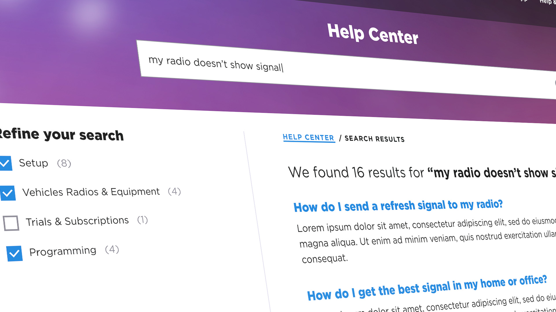
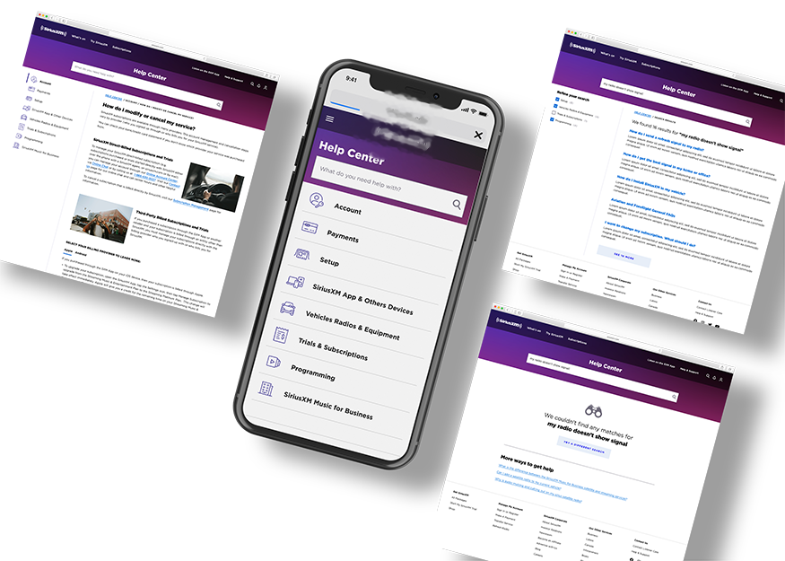
The client is a broadcasting company of satellite and online radio. With massive traffic to their phone-centric Help Center, the company decided to revamp the user experience of their online version -- to make it possible for users to help themselves.
Details
- Product: Responsive website.
- Project timeline: 8 weeks.
- My role: UX Designer.
- Team: UX designer (me), UI designer, Content Strategist and Project Manager.
inside the project
the challengeStreamline the client's approach to knowledge management across all of its customer-facing channels, making information and other relevant content accessible to customers in a seamless and user-friendly manner. We were able to identify that users were unable, in a large number of cases, to resolve technical difficulties through the Help Center due to the way both the sections and the content of each section were structured, which generated enormous frustration, from a content and visual design point of view:
- Customer experience and design current state assessment: identify listener needs and trends, stemming from customer research through feedback areas (e.g., call center, chat, website)
- Content & system functionality gaps and needs documentation: align on key areas of functionality improvement to help internal stakeholders manage and maintain KM systems and content (e.g., process, style alignment).
- Current knowledge management systems, tools & available capabilities intake: provide viewpoint on current technology stack including areas of improvement, tool limitations, and tech add ons.
- Knowledge management enhancement collection: develop comprehensive list of knowledge management enhancements that address customer experience areas and current state pain points, prioritizing them based on value and feasibility.
key objectives
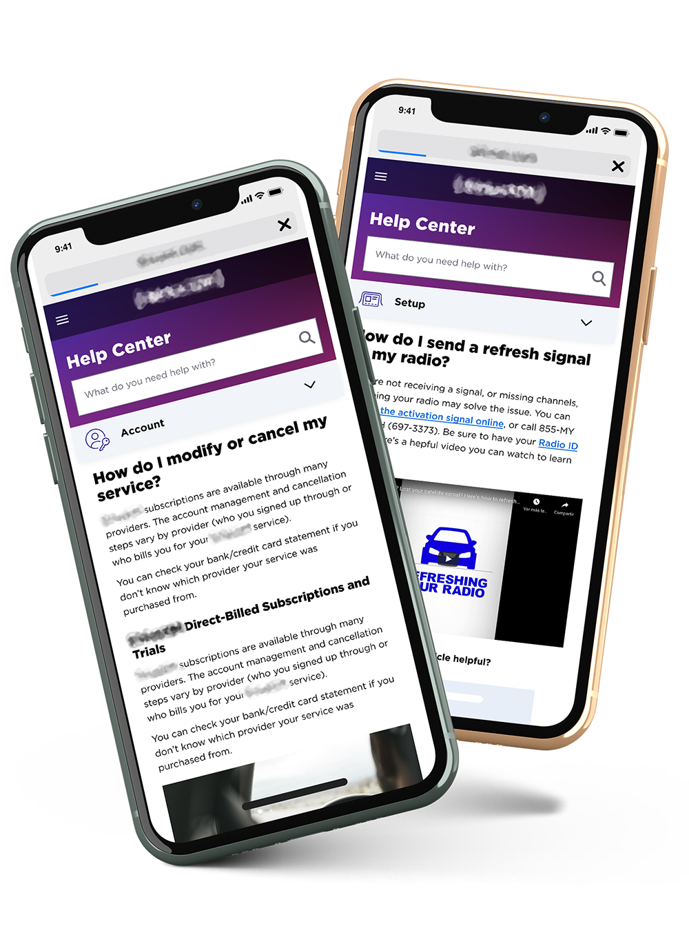
Achieve a robust tool in terms of experience, back end and visual design, achieving in a few steps the solution of the user's technical issues, where the relevant content for the solution of the problem, whatever it is, is addressed by the user in a comprehensive and effective way, due to the articles immersed within the platform, product of an exhaustive review of them, providing a satisfactory result in most cases, thus reducing the time and efficiency of the consultations made by the users themselves to the Help Center.
- Drive increased usability of prioritized areas of focus within the knowledge experience.
- Better knowledge findability through improvements to the overall taxonomy and SEO strategy.
- Improve internal serviceability of knowledge platform to ensure regular upkeep and maintenance of the ecosystem.
desired outcomes
The visual redesign and user experience improvements will seek to achieve intuitive navigation and interactive elements that meet a pleasant and immersive user experience, prioritizing usability and accessibility, ensuring that users can easily navigate and interact with the product, The redesign was always intended to be aligned with the brand's identity and values, contributing to a cohesive and memorable experience for users. In this way, users will be able to successfully solve the problems for which they entered the Help Center.
- Triage existing call and chat center volumes
- Improve customer satisfaction of the existing knowledge management articles and overall experience
- Increase customer knowledge and confidence on the SXM website
- Drive competitiveness as a best-in-class knowledge base company
Exploration
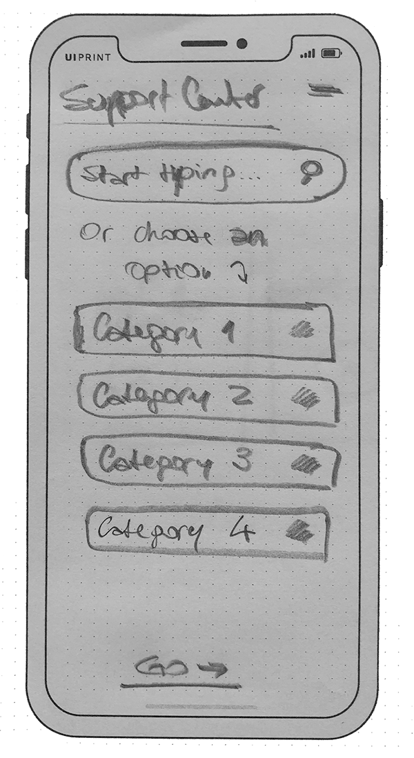
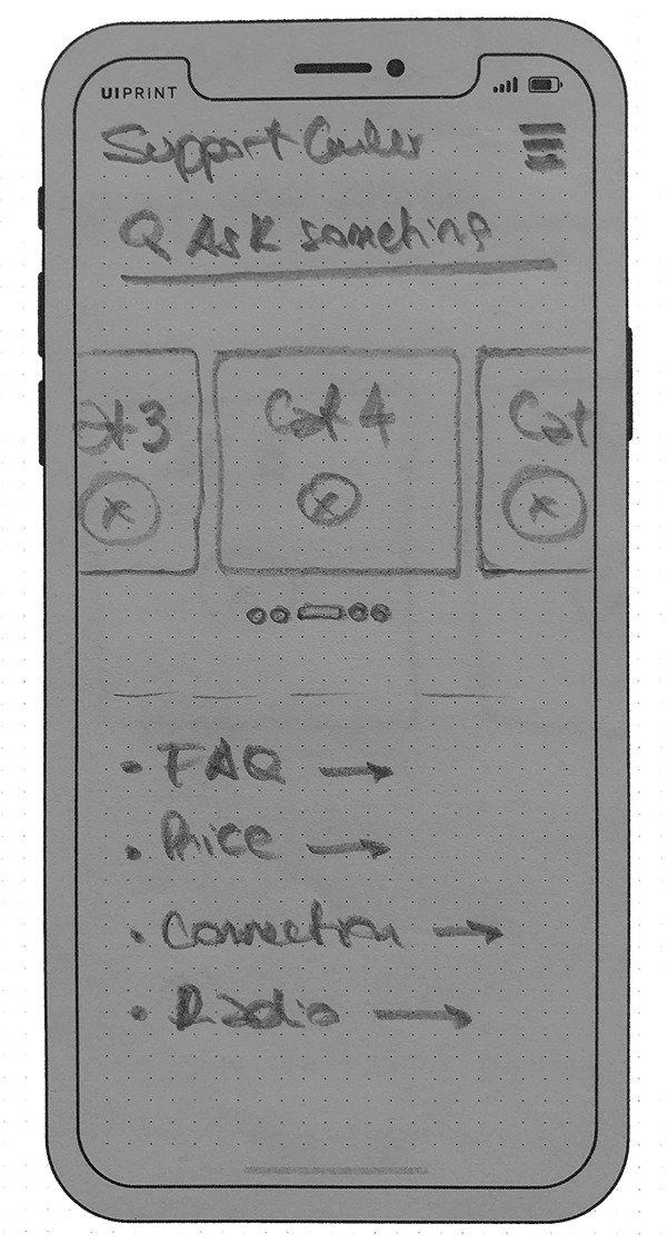
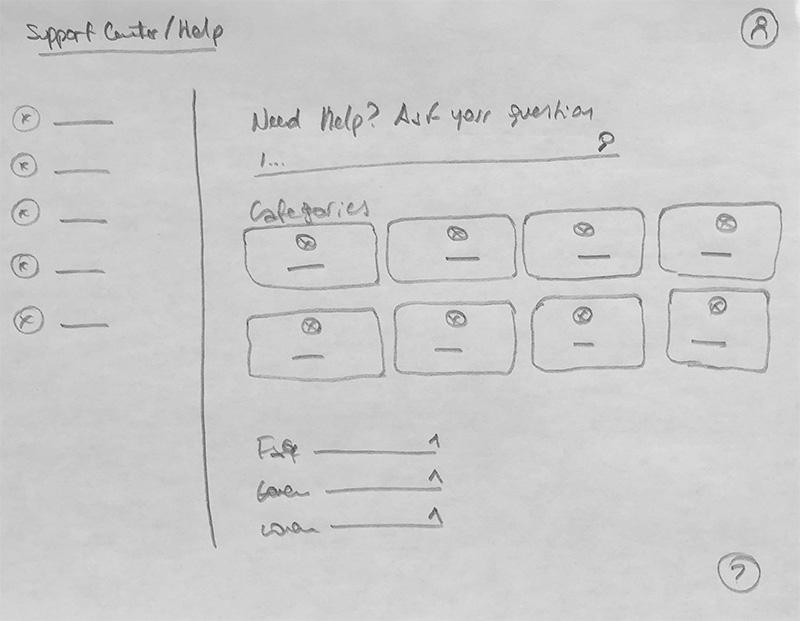
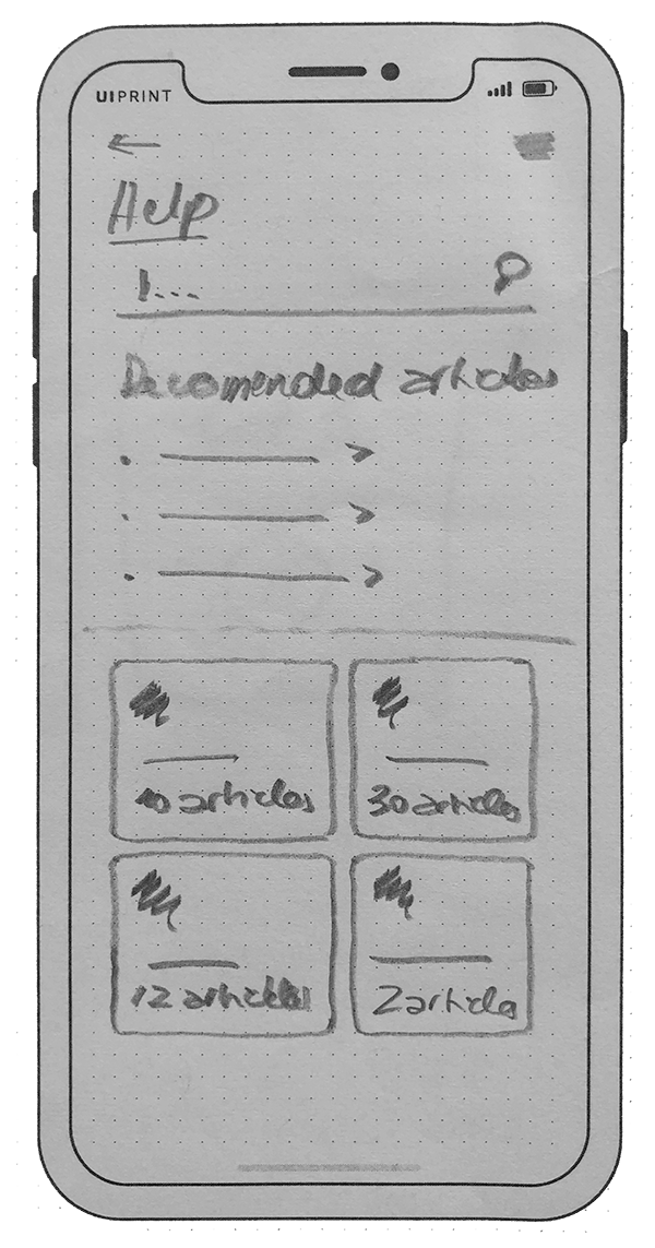
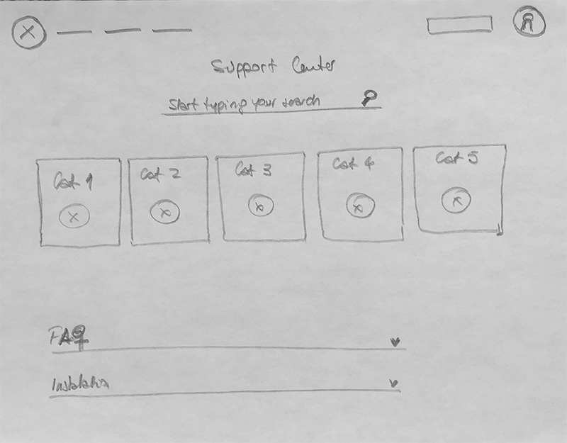
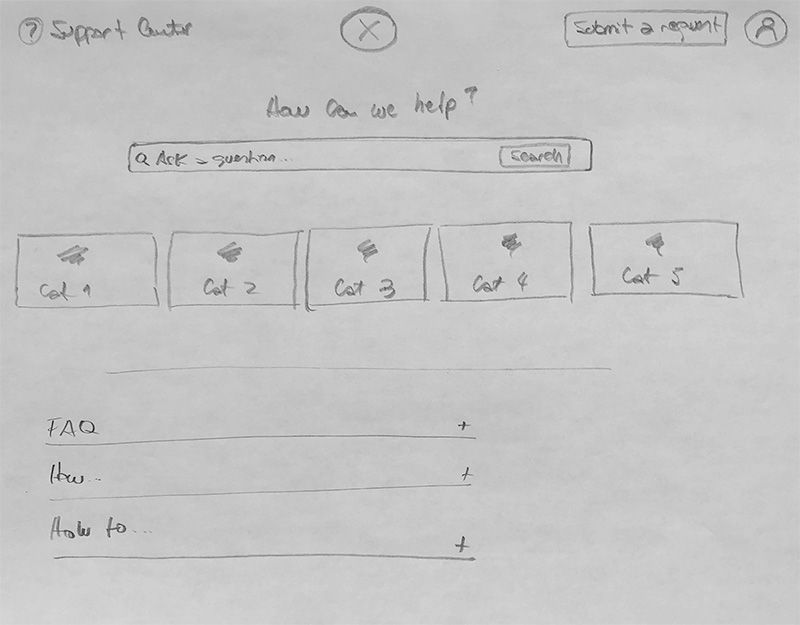
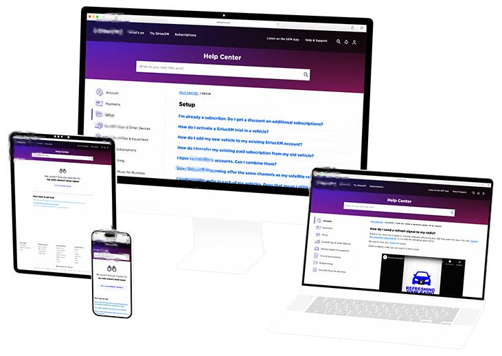
As part of an iterative process aimed at finding the most convenient option for the client, multiple explorations were carried out on paper to converge on the best possible solution.
Visitors
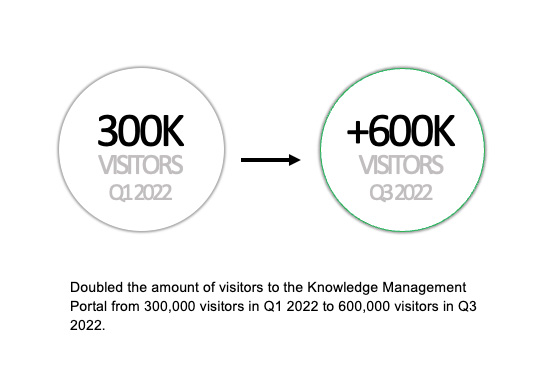
We achieved a doubling of traffic to the Knowledge Management and FAQ section of the website within 6 months (Q3 2022).
Digital KM traffic has more than doubled, impacting positively the call center volume.
This is largely due to the projects delivered over the past months, which significantly improved the taxonomy, content and design while optimizing the usage and configuration capabilities.

